
A well-designed logo is an important part of every company’s brand, and health coaching is no different. If you want to make a strong first impression on potential clients, and a beautiful logo combined with a fantastic business name will put you ahead of the competition right away.
A great health coaching logo is distinctive, professional, and doesn’t need to be explained. Many people assess others based on their appearances, and a logo serves as a visual representation of you and your business. Therefore it must look excellent.
Consider how terrible logo designs have harmed established corporate giants in the past. Imagine what it could do to your company. To avoid this, this article has prepared all the useful tips and necessary information related to making a splendid health coach logo.
Making A Health Coach Logo

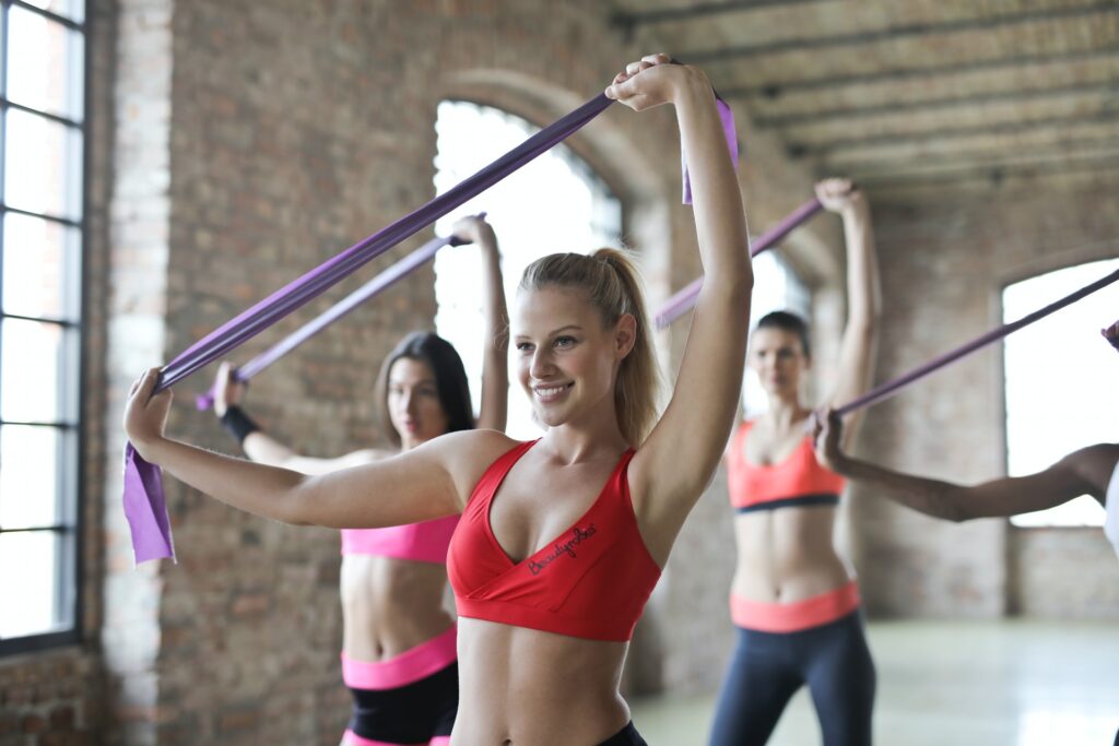
If you spend your passion and abilities to helping people feel and perform better as a health coach. Clients may seek advice and assistance from you, and your services may be exactly what they require as they strive for improved health. However, before you can assist them, they must first learn about your company and feel driven to make an appointment.
Your company logo can help you make a good first impression by indicating that you can assist them in living a healthier lifestyle. The colors, symbols, icons, and font types you use for your health coaching business logo can all convey this idea.
What Makes A Good Health Coach Logo?
Health coach logo: Making a logo requires a certain amount of psychology. Shapes, colors, and text impact the subconscious mind, which controls emotions and behavior. With this knowledge, you may choose precise design components to influence how people respond to your health coaching business. The elements of a logo and what they signify are listed below.
Colors
- Green, Blue
Consider the values you want to express while picking colors for your design. The colors green and blue appear in the Rejoice Nutrition & Wellness and NutritionWorks logos, which are generally connected with nature and health and represent health and harmony. It can also represent wealth and ambition. The blue tones in Rejoice give it a bright, energizing feel. Blue is a soothing, calming color that exudes reliability and dependability. For health and wellness logos, blue might be a great choice.
- Orange, White
Happy Belly Health’s logo is a vibrant orange. The bright, joyful orange is toned by the design’s white parts, making it less overpowering. This color may be highly helpful in attracting someone looking for a health coach who is looking for a life with more energy and passion. Individually, orange emits a warm and friendly vibe.

- Red, Yellow
Red is a powerful, high-impact color that grabs people’s attention. However, it may not be compatible with a healthcare organization.
Yellow is a vibrant color that evokes feelings of happiness and love.
- Purple
Purple is a color associated with royalty and refinement. It’s a terrific option for healthcare firms.
The colors you select to symbolize your company may also be influenced by your own personality and teaching style. A light green, rather than a really dramatic color like hot pink, would be a better choice if you adopt a peaceful, tranquil, and caring attitude to your client encounters. Create a logo that reflects your company’s personality and ideas to help you attract customers who will value what you have to provide.
Icons And Shapes
Health coach logo: Any symbol that strongly shows your brand and interacts with clients qualifies as an icon. It must be simple and express a lot with very little for it to work.
They should be relevant and appeal to your target audience. Good-looking, Well-designed, and well made.
Shapes and symbols have an aesthetic that generates the feelings and associations you wish to create. Here are some of the most prevalent logo shapes and what they mean psychologically:
- Eternity, the universe, and mystery are all represented by circles.
- Discipline, strength, and dependability are all represented by squares and rectangles.
- Triangles and upright triangles represent stability and equilibrium, whereas upside-down triangles represent risk, energy, and danger.
Plants are several images and symbols that can be used effectively in a logo. Many health-related themes can be represented by symbols such as seedlings or fully grown trees, which are commonly connected with nature. Rejoice Nutrition & Wellness and Happy Belly Health chose these photos.
Fonts
Fonts are several types of styles that are employed to generate different effects. Fonts, like colors and shapes, have a significant psychological impact. Many of the individuals seeking your services will be dealing with health issues or dissatisfied with their present state of health, so a font type that appears friendly and inviting may persuade them to seek your assistance. Rejoice A flowing script font is used by Nutrition & Wellness and NutritionWorks to achieve this. The letters in Happy Belly Health have rounded corners, which softens their appearance. Think about the tone you want to express and how the font style fits into that.
Fonts are divided into four categories:
- Small embellishments at the end of each character are known as serifs. Tradition, trust, and dependability are all conveyed by serif typefaces. Times New Roman and Georgia are two popular serif typefaces.
- Sans serif typefaces lack the tiny flourishes that characterize serif fonts, conveying stability and pragmatism. Popular fonts include Helvetica and Futura.
- Script typefaces resemble calligraphy and are associated with elegance and creativity. Alex Brush Script and Blackjack are two script typefaces.
- Modern – The word “modern” connotes “assertiveness” and “strong.” Century Gothic and ITC Avant Garde are two well-known modern fonts.
When someone is ready to use your health coaching services, your logo might make it easier for them to contact you. Create a logo that communicates what you have to offer and the promise of greater health that you may achieve together.
Limit yourself to two fonts while designing your logo. Anything beyond that will appear crowded. In most cases, your company name will be in one typeface and your tagline in another. When combining fonts, it’s also a good idea to pick two that aren’t too similar.
Health Coach Logo ideas
To assist you in coming up with ideas for a health coach logo. Here are six examples of effective health coaching logos, as well as what makes them so unique:
The logo of Eat Innovations is made out of rich brown and green colors, implying that the company’s foods are fresh and natural. The tagline’s softly angular phrase contrasts nicely with the top line’s soft, rounded font. A cunning surprise is the optical illusion of a cloud, spoon, and raindrop.
Marisa Wiewell’s logo’s blast of celebratory colors communicates enjoyment and enthusiasm. A fork’s optical illusion is a creative visual element. The arc of her sign is also a nice design element, as it follows the contour of the tree slightly.
The woodsy brown and green tones of Beth Lindley’s logo, as well as the fresh, graceful seedlings, represent nature, newness, and growth. Beth’s name is written in a slightly rounded font that appears cheerful and welcoming. The typeface on the slogan is just different enough to create an effect.
Linda’s logo is vibrant and alive with movement. The cold white signature is relaxing and inviting, and the colors are cheerful and complementing. Linda chose a slim font for her name that doesn’t compete with the illustration’s tremendous vitality. This logo will be associated with happiness and pleasure by clients.
Aurelie’s gorgeous logo’s features all emphasize the notion of honesty and trust. The cool color scheme is calming and peaceful.
The softly rhythmic lines flow in a pleasant and tranquil manner. Another soothing element is the flower’s delicate watercolor wash, and its vertical bloom conjures sentiments of hope and progress.
The vibrant colors of the fruits and vegetables in this logo evoke a pleasant image of the company’s health-related services. The phrase has a nice rhythm and rhyme to it, and it appears to be a personal statement. Farm-A-slim, Sea’s breezy typeface, continues the notion of lightness and freshness.
Important Things To Consider When Making A Logo
Depending on the logo design you choose, your company logo might express a variety of messages. It’s ideal to brand your firm with a logo that clearly represents what you’re selling to your customers, using symbols, icons, colors, and typefaces. A logo for a burger restaurant, for example, might include burgers and fries.
Color Psychology
Colors in your business logo design can assist establish your company’s atmosphere. When creating a health coach logo, think about which color scheme would best represent your logo design.
Design
When it comes to establishing an effective and accessible logo design, there are some basic guidelines to follow.
Customers should be able to read and recognize the typeface they choose.
The readability of your company logo is dependent on color contrast.
Conclusion: Health Coach Logo
A logo is more than just an icon. It’s a tool for branding. The objective is to create a health coaching logo that speaks for itself.